Identity · v 1.0 · 2026
The Oasis Studio Brand Book
A reference for the architectural language of Oasis Studio — the marks, colours, typography, and voice that compose our atelier of living nature.
01 · The Mark
Icon
The standalone icon is the most reduced expression of the studio — reserved for favicons, app tiles, embroidery, wax seals, and any context where the wordmark cannot breathe.
- · Minimum size — 16 px digital · 8 mm print
- · Clear space — ½ the icon height on every side
- · Never re-draw, outline, or apply effects
01 · ii · Icon Variants
The Mark on Brand Colours
The icon is monochromatic and reverses cleanly across the full palette. Always render in a single tone — ivory on dark surfaces, obsidian on light. Never tint the icon to a third colour, and never place it on a photographic background without a solid panel beneath.
Obsidian

Primary surface
Graphite
Secondary surface
Ivory
Print & stationery
Bronze
Accent applications
Moss
Editorial & seasonal
Reverse Bronze
Foil & embossing
Rule
Clear Space
Maintain a margin equal to half the icon's height on every side. Nothing — type, rule, image — enters this field.
Rule
Minimum Size
16 px digital · 8 mm print. Below this, the inner form collapses and the mark loses its silhouette.
Rule
Do Not
Outline, gradient-fill, drop-shadow, rotate, stretch, or recolour to a third hue. The mark is single-tone, always.
02 · Lockups
Horizontal & Vertical
Horizontal
Primary configuration. Used in the site header, email signatures, and landscape collateral.
Vertical
Used for square placements, tote bags, packaging seals, and Instagram avatars where height matches width.
03 · Colour Applications
Logo on Black, White & Brand
On Black · Primary
On Ivory · Inverted
On Bronze · Accent
Obsidian
oklch(0.14 0 0)
#1B1B1B
Ivory
oklch(0.94 0.018 90)
#F1ECE0
Bronze
oklch(0.62 0.11 55)
#B07A48
Moss
oklch(0.45 0.06 145)
#4A6B57
Graphite
oklch(0.22 0 0)
#2B2B2B
04 · Typography
The Voice in Form
Display · Cormorant Garamond Light
Aa Bb Gg
Living nature, architectural form.
Body · Inter 300 / 400 / 500
Aa Bb Gg
Inter holds the practical voice of the studio — captions, body copy, navigation, and any UI surface. Use 300 for atmosphere, 400 for reading, 500 for emphasis. Never bold.
05 · Voice
Tone of Voice
Principle
Considered
We write the way we plant — slowly, with intention. Short sentences. Honest verbs. Nothing decorative for its own sake.
Principle
Grounded
We speak from the studio floor, not the marketing deck. Plain words about soil, light, glass, and time.
Principle
Quietly Poetic
Permission to be a little literary. A single image, never a paragraph of them. The room should feel hushed when we speak.
We Say
- · "A small world, held in glass."
- · "Cultivated in Vancouver."
- · "Join us at the bench."
We Don't Say
- · "Crazy good vibes 🌱✨"
- · "DIY plant hack you NEED"
- · "Buy now — limited time only!!"
06 · Foundations
Brand Pillars
Pillar I
Living Craft
Every ecosystem is built by hand at the bench in Vancouver.
Pillar II
Architectural Form
Composition, proportion, and negative space carry equal weight with the planting.
Pillar III
Quiet Stewardship
We tend before we sell. Aftercare and education are part of the object.
Pillar IV
Native Sensibility
The Pacific Northwest — moss, stone, rain light — is the source material.
07 · Hierarchy
Typographic Hierarchy — Social & Video
A fixed scale used wherever type meets image — Instagram, Reels, TikTok, carousels, and motion graphics. Always set in ivory on a dark image, or obsidian on ivory. Never both at once.
H1 · Statement
Cormorant Garamond Light · 96 / 1.0 · −2% tracking
A small world, held in glass.
H2 · Subject
Cormorant Garamond Light · 56 / 1.05
Autumn Terrarium Workshop
Eyebrow · Context
Inter 500 · 12 / 1.4 · +32% tracking · UPPER
Issue 04 — November 2026
Body · Caption
Inter 400 · 16 / 1.6
Bring a friend, a notebook, and a slow afternoon. We supply the glass, the moss, and the tea.
Micro · Credit
Inter 400 · 10 / 1.4 · UPPER
Photographed at the Studio · Mount Pleasant
Workshop · 04
A small world,
held in glass.
Sat · Nov 16 · 11.00
Journal · 011
Notes on rain light, moss, and the quiet hour.
Read at oasisstudio.ca
Lower Third · Reel
Maya · Studio Lead
on building the autumn vivarium
08 · Cinematography
Light, Shape & Living Form
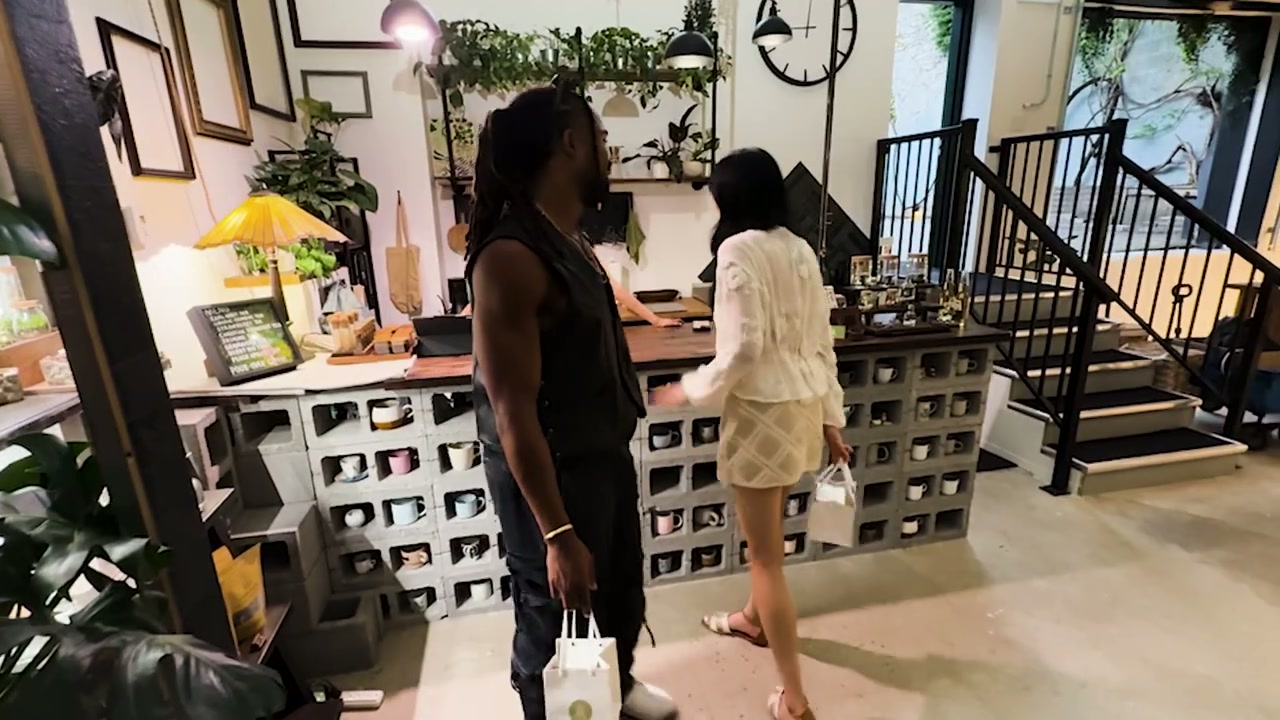
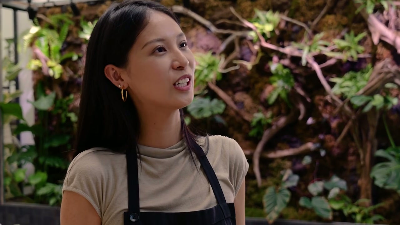
Product imagery is treated as still life — never lifestyle, never staged with people. Each composition is built on three primaries: a single living object, a geometric architectural surface, and a hard projected shadow of leaves or pure form. Light is directional and singular. Colour stays within Obsidian, Ivory, Bronze, and Moss.

Principle
One Light
A single hard source — sun through a window, or a tungsten spot. Never softboxes, never fill.
Principle
Cast a Shape
Every frame carries one projected silhouette: a frond, a fan, a triangle, a slab of negative space.
Principle
Architectural Plinth
Subjects rest on plaster, concrete, paper, or bronze. The surface is part of the composition.
Principle
Restraint
One subject per frame, or a quiet triad. Never crowd the glass. Negative space is the supporting actor.
We Shoot
- · Glass against plaster, with one hard shadow.
- · Bronze rim light at golden hour.
- · Geometric stone props — cube, sphere, slab.
- · Medium format aesthetic, fine grain.
We Don't Shoot
- · Hands holding the product.
- · Cluttered shelves or "shop" backdrops.
- · Saturated coloured gels or neon.
- · Soft, even, catalogue lighting.
End · Brand Book v 1.0
Tend the brand the way we tend the glass — quietly, often, with care.